〈☉☉ Unpacking Ambition〉Invisible by Design: The Art of Thoughtful Food Packaging
Small but Crucial Pain Points in Everyday Life
In everyday life, we all encounter designs infuriating enough to make our blood boil,a foil pouch that refuses to tear open, an egg carton that breaks apart the moment it is opened, or a condiment sachet that squirts all over our hands. As a designer, I often feel that the best design is the most “invisible.” It does not clamor for attention with flashy visuals; instead, it quietly tucks warmth and thoughtfulness into the smallest details of how a product is used.
When packaging ceases to be merely a “container” and uses structure, shape, materials, and behavioral cues to resolve the small but crucial frustrations of daily life, the value of design instantly takes on emotional significance. For this installment, I have selected seven unconventional packaging solutions that are exceptionally clever in the way they guide behavior, revealing how these brands use ingenious design to think one step ahead for the consumer.
Method One: Clever Tactics, Greater Reassurance—Designing Anxiety Away
Case 01 Meiji Cheese Ball: When a Funny Face Becomes a Thoughtful Warning
Photo_Mak
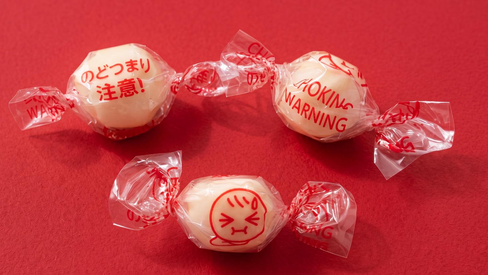
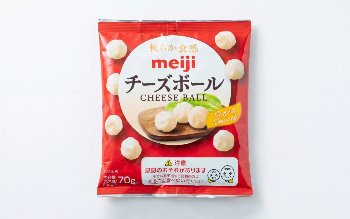
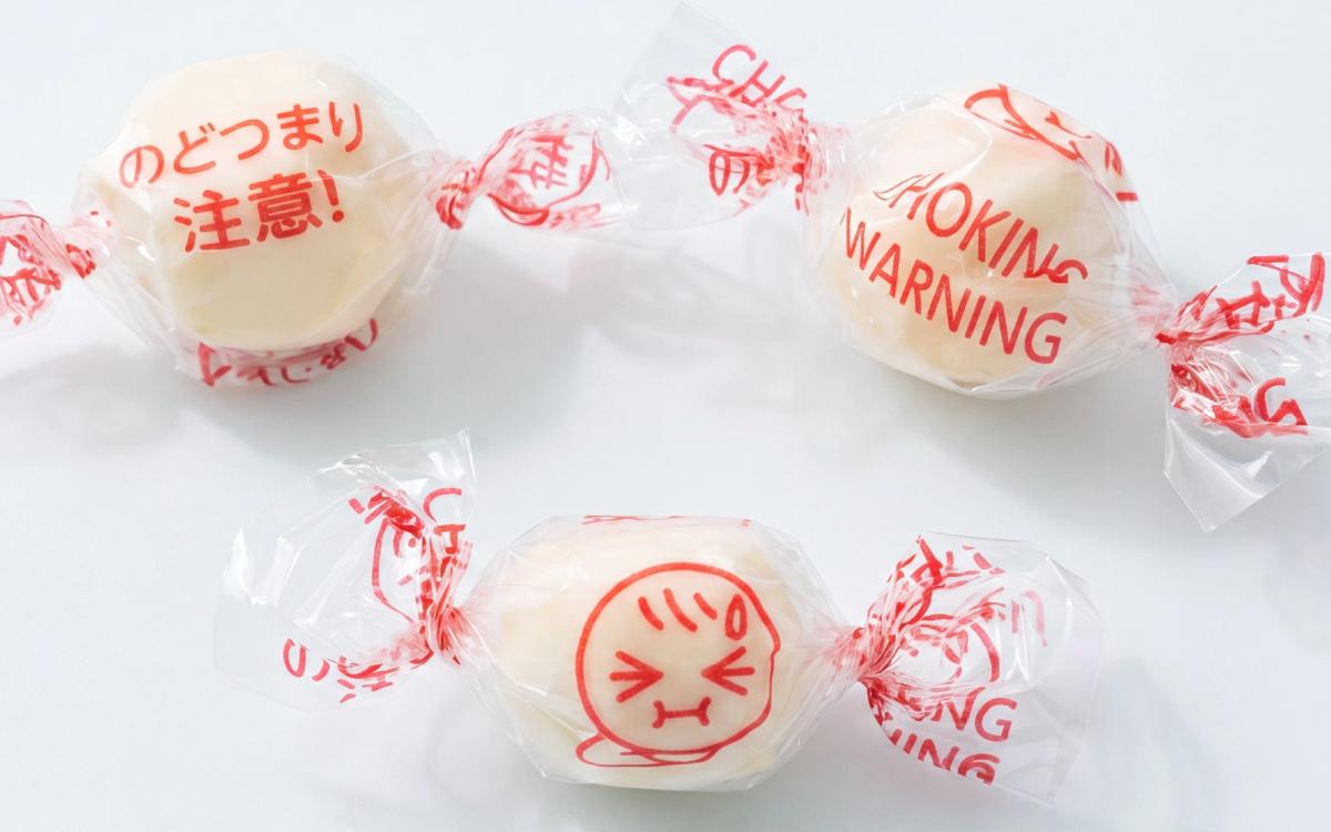
1 / 2Warnings on ordinary packaging are often stiff and blunt: “Choking hazard,” “Not suitable for children under a certain age,” and so on. They satisfy regulatory requirements, but do not necessarily reach consumers on an emotional level. Once, I happened to buy a pack of Meiji Cheese Ball and was deeply impressed when I opened it. With their springy texture and spherical shape, the cheese balls do pose a choking risk to older adults and children who have difficulty swallowing.
Meiji does more than issue a warning on the outer package. Even the clear wrapper around every individual cheese ball is printed with a funny face that looks as though it is about to choke. The design is remarkably clever. Its imagery is both deeply empathetic and instantly readable as a warning: at the very second a parent or an older person tears open the wrapper and prepares to take a bite, the illustration delivers a warm reminder to “chew carefully.” Translating a potential danger into a friendly visual, that is thoughtfulness made visible.
Case 02 Yakult: A Fingertip-Friendly Waistline, Familiar for Half a Century」
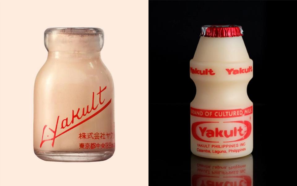
How did Yakult’s familiar bottle acquire its shape? In the 1950s, Yakult commissioned Japanese industrial designer Isamu Kenmochi to design the brand’s container, replacing the original glass bottle with a plastic one and ultimately giving rise to the classic form still used today. It is said to have been inspired by the round, approachable form of kokeshi dolls from Japan’s Tohoku region, and the bottle has become a highly recognizable brand symbol.
The true stroke of brilliance lies in the waistline drawn inward at the center of the bottle. It makes the container easier for children and older adults to hold and reduces the risk of it slipping from their hands due to condensation. The bottle is compact and well balanced; together with a moderately sized opening and foil seal, its form encourages drinking straight from the container. The design helps control the rate at which Yakult flows into the mouth, making it more comfortable and reassuring to drink.
Yakult’s design does not chase a dazzling form for its own sake. Instead, it integrates ergonomics, brand identity, and everyday use within a single container. This tiny bottle brings together grip, drinking behavior, recognizability, and cultural imagery all at once, making design an integral part of the product experience.
Method Two: All in One—Packaging That Does Away with Extra Utensils
Case 03 MyDays Honey Citron Tea: The Spoon Pack That Simplifies Everything
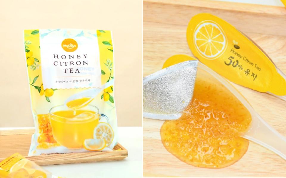
Traditional liquid or paste-like citron preserves are usually sold in glass jars, requiring a separate spoon every time. Any moisture left on the spoon can also make the preserves go moldy.This brand identified a different use case: the citron preserves are sealed directly inside a specially designed plastic spoon, with the spoon’s bowl filled and covered by a sealing film. To prepare the drink, simply peel off the film, place the entire spoon in a cup, add water, and stir.
The cleverest detail is that the package itself doubles as the stirrer. There is no need to prepare another spoon, and your hands stay clean, that is a truly all-in-one experience. From storage and portability to brewing, every step has been rethought for greater convenience. It is a thoughtful piece of packaging that balances practicality with user experience,and a genuine blessing for busy office workers.
Case 04 EcoTesil Eco-Friendly Disposable Spoon: Fold the Paper Lid into Cutlery
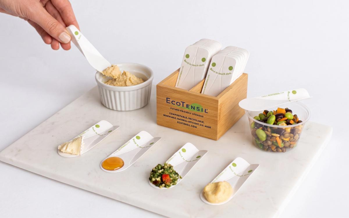
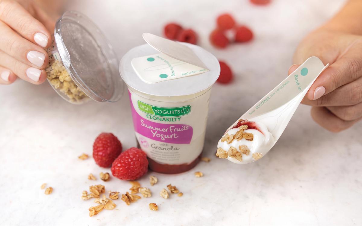
California-based EcoTensil has introduced AquaDot® plastic-free paper cutlery, replacing plastic spoons with a foldable paperboard structure. The design not only responds to the environmental movement; it also redefines the relationship between packaging and the user experience.
The flat paper piece is attached directly to the food package. A simple fold along the marked points on the paperboard immediately turns it into a sturdy three-dimensional spoon. While concealed, the paper spoon remains completely flat, saving considerable packaging space. It can also be produced using existing packaging and production-line equipment, reducing the cost to brands of switching to a more environmentally friendly material.
Beyond its structural ingenuity, EcoTensil treats the sensory experience as an essential part of the design. Wooden utensils can leave behind a woody smell or a rough sensation in the mouth. By optimizing the paper utensil’s edges, thickness, and surface feel, EcoTensil makes it smoother on the lips and less likely to interfere with the food’s original flavor. For products such as yogurt, ice cream, and salads,where taste is paramount, that gives EcoTensil an additional competitive advantage.
Case 05 Pakitte Single-Handed Twin-Condiment Pack: Fold, Squeeze, and Keep Your Hands Clean
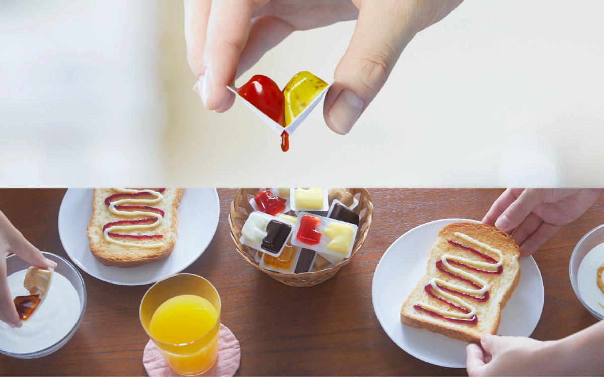
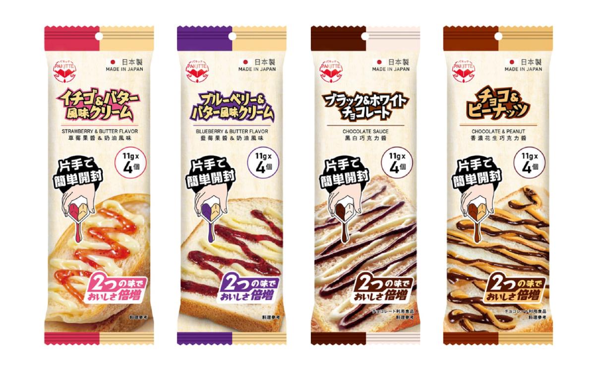
Miniature condiment packs often present the same frustrations: they get sauce on your hands when torn open, never squeeze completely empty, and still require a knife or spoon for spreading. With a globally patented design, the Japanese brand Pakitte overturns our assumptions about what a condiment pack can be.
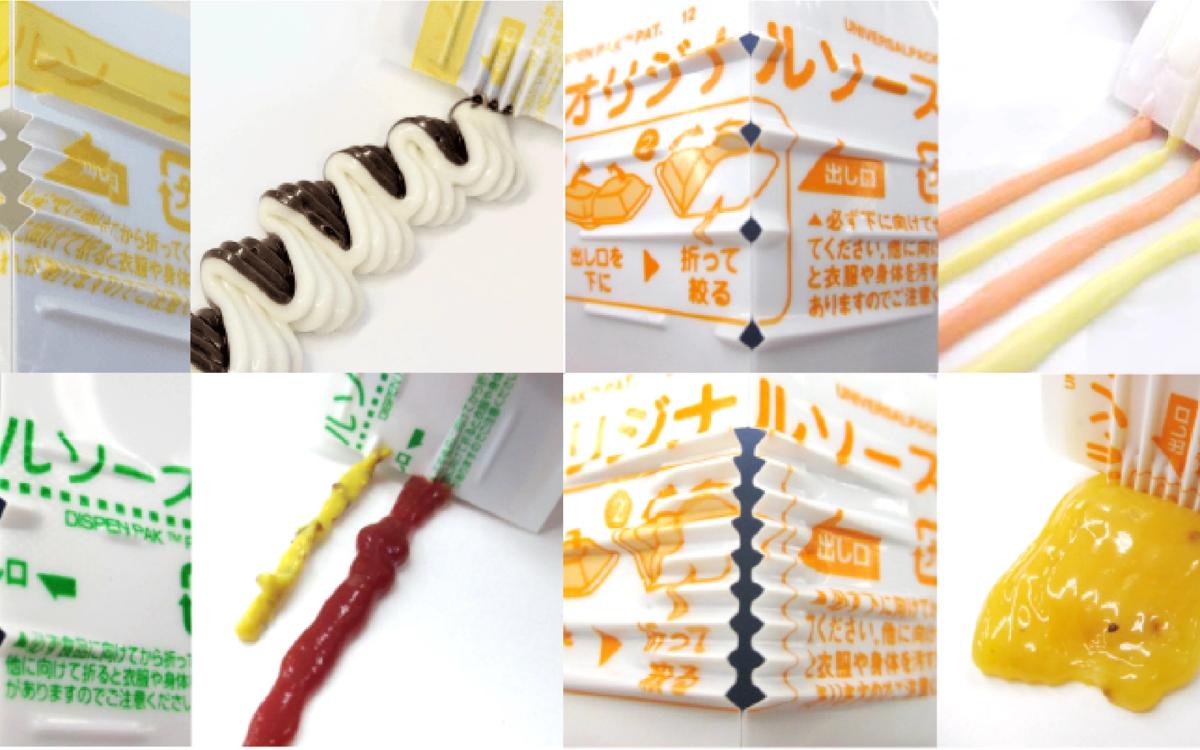
To use Pakitte’s patented, mess-free condiment pack, simply bend and squeeze the small container. The sauce flows directly from tiny openings and can be dispensed evenly over toast, hot dogs, or any other food. No additional spreader is required, and your hands stay clean.
More interesting still, Pakitte does not come in just one format. The company has developed a range of opening shapes and compartment ratios to suit condiments of different viscosities and quantities, as well as different use cases. The “four-opening mountain” format, for example, produces ribbon-like lines of sauce suited to decorating desserts. The “W-Twin” alternates two different colors,or flavors,through four outlets, while the “F-type” lets users control the order in which two different sauces are dispensed, and how much of each, creating varied decorative effects and layers of flavor that even look good in photographs. A “wide outlet” version, meanwhile, can spread sauces containing semisolid ingredients more effectively.
These diverse packaging formats respond to different ways of using and combining sauces. From breakfast spreads and everyday afternoon snacks to outdoor travel, they offer a more intuitive, neat, and convenient experience. It is hard not to admire the thoughtful, consumer-first consideration evident in every detail.
Method Three: Fluid Mechanics in Everyday Life.The Art of a Smooth, Controlled Pour
Case 06 Oatly Oat Milk Carton: An Off-Center Spout and an Innovative Shape
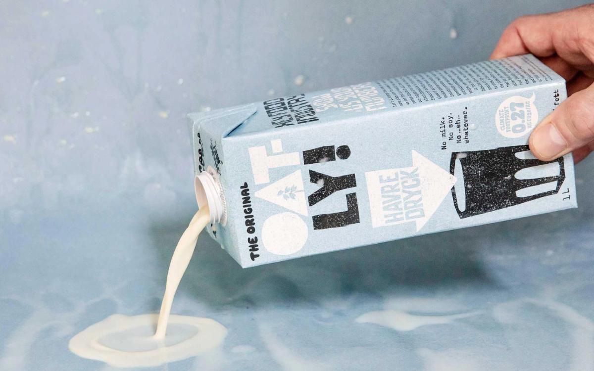
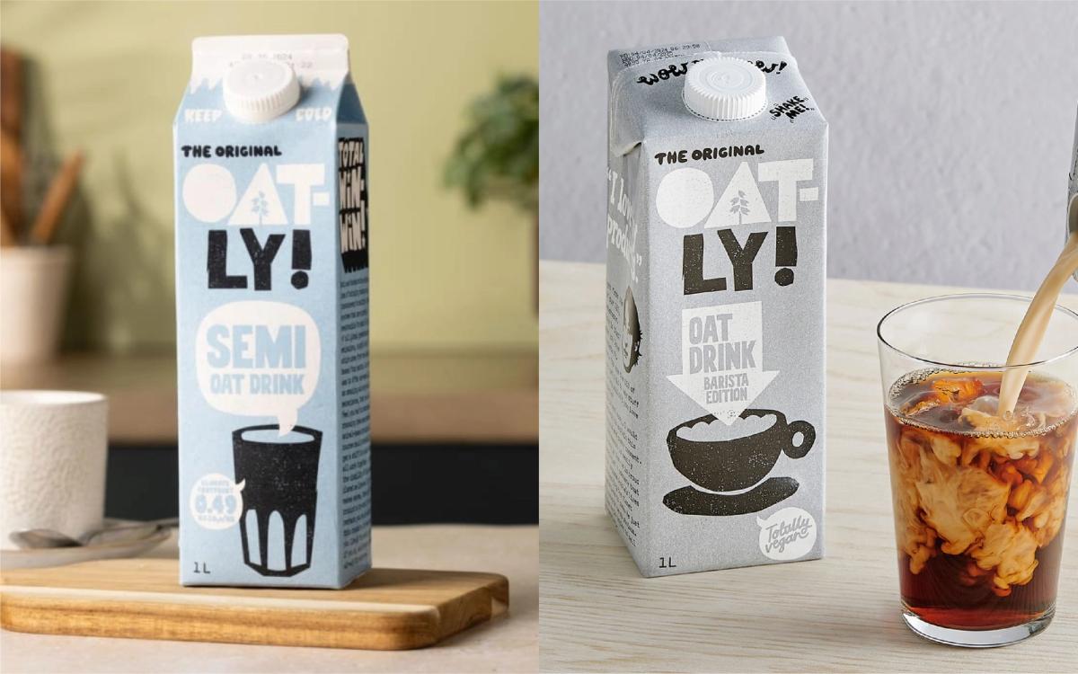
While most oat milk brands continue to use conventional dairy packaging, Oatly chose to rethink every detail from the user’s perspective. Rather than positioning the spout at the center of the top panel, it places it near a corner of the carton, making the oat milk easier to pour and the flow rate easier to control. This small change in angle reduces splashing and produces a steadier stream when pouring latte art, making everyday use more fluid.
Oatly’s design thinking does not stop at the spout. It also reworked the carton’s overall form, replacing the sloping gable top of a traditional milk carton with a squarer rectangular structure. Used across most of its product range, the form greatly improves stacking and transport efficiency. Rather than pursue design consistency for its own sake, the brand adopts different packaging formats according to product positioning, with the user, production line, and market requirements in mind.
I believe that innovation capable of truly moving consumers does not necessarily come from complex technology. More often, it begins with careful observation of how something is used. Oatly treats packaging as part of the product experience. From pouring and transportation to brand communication, every design choice responds to a real need, proving that packaging is more than a container: it is an extension of brand value and user experience.
Case 07 Kikkoman Soy Sauce: The Drip-Free Secret Hidden in the Spout
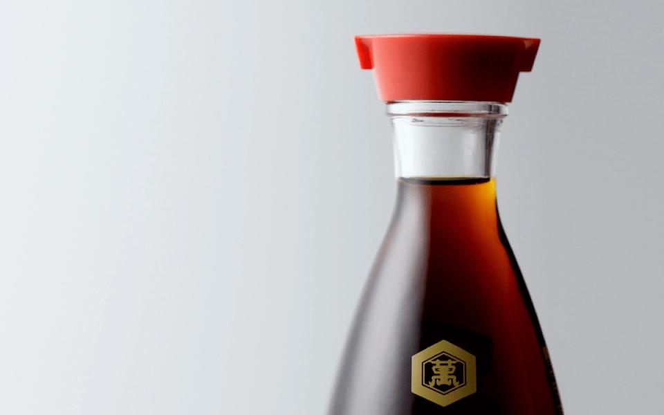
The most easily overlooked detail in liquid packaging is often the spout. When pouring soy sauce, olive oil, or cooking wine, many of us have had the same experience: the final drop runs down the side of the bottle, leaving the spout sticky and creating a stubborn stain on the dining table or refrigerator shelf. In recent years, many brands have added flow-guiding features to their caps. Specially shaped openings, channels, or stopper structures direct the liquid into a stable stream, reducing splashing, back-dripping, and residue.
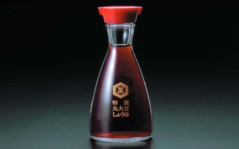
The most representative example, and one still far ahead of the rest, is the classic red-capped dispenser created for the soy sauce brand in 1961 by Japanese design master Kenji Ekuan. The seemingly simple red cap contains a precise application of fluid mechanics. Its two-way symmetrical spouts allow the soy sauce to flow smoothly; when the bottle is returned upright, surface tension at the rim draws even the final drop back into the bottle, preventing drips. A small hole at the top of the cap also uses air pressure to control the flow: covering it lightly with a finger stops the soy sauce, allowing every pour to be more precise. Ekuan did more than design the outer form of a soy sauce dispenser: he gave the spout an entirely new function and, with it, created a more convenient and sustainable way of life.
At its heart, packaging design is about “communication.” When planning a brand, we are often too quick to spend our budget and energy on making the logo more prominent or the colors more appealing. We forget that the package will ultimately land in a consumer’s hands, where it must interact with human hands, eyes, and habits. In truth, packaging is not merely the clothing a product wears. It is also a gentle conversation between a brand and the people who use it, their hands and their minds, even amid the pressures of everyday life.
Has a packaging detail ever left you feeling quietly and tenderly cared for? From the empathetic warning faces on Meiji Cheese Ball and the MyDays spoon pack to the ergonomics and fluid mechanics that have endured for half a century in the Yakult bottle and Kikkoman dispenser, the designers behind these examples did not spend their budgets on extravagant appearances. They invested their attention in the details that “think one step ahead for the consumer.”
The finest packaging design is often the most “silent.” At the moment of use, you feel no resistance; instead, a thought rises quietly in your mind: “Wow, this brand has considered everything.” That feeling of being cared for is the core value that allows a brand to reach people most deeply—and the value that is hardest to replace.

Graphic Designer.Mak
A graphic designer from Macao who now lives in Taiwan, Mak has spent nine years immersed in the design industry, often deep in the details of brand planning and packaging design. She especially enjoys “making the rounds” of supermarket shelves around the world. Beautiful typography and layouts make her heart race; an ingenious structure makes her want to take it apart on the spot. Instagram: @little_mak_