〈☉☉ Unpacking Ambition〉Portuguese Tinned Fish, Reimagined: Five Classic Brands Preserving Tradition in Style
Portuguese Tinned Fish: An Everyday Essential in Macao
A few years ago, I caught sight of the familiar face of PORTHOS—known in Macao as the “Old Man” brand—at an imported-food supermarket in Taipei, and felt an immediate stir of recognition. For those of us from Macao, Portuguese tinned fish is part of our collective everyday memory. Whether it is served with toast or dropped into a bowl of instant noodles, its rich, savory aroma is something we have known since childhood. In recent years, however, this “old familiar taste” has taken on an unexpectedly refined new look, a transformation driven by an industry and a group of brands willing to evolve with the times.
To safeguard sealing techniques said to have been passed down since the 18th century, Portugal’s National Association of Canned Fish Industries (ANICP) has worked to weave tradition, quality, and sustainability into packaging, establishing Loja das Conservas (LCM) specialty stores in Portugal. Macao, shaped by centuries of Portuguese colonial rule, still bears that influence today; a small LCM remains on Rua do Cunha in Taipa’s old quarter. Bringing together more than 50 producers and over 600 varieties of tinned fish, LCM has successfully turned a functional food born as military provisions into a collectible “cultural souvenir.”
In recent years, the classic PORTHOS brand has not been alone in staging a glamorous reinvention; others have shown the same ambition to change. From a designer’s perspective, I have selected five Portuguese tinned-fish brands worth watching. Here is how these humble tins have used design to travel from the dining table to the shelves of curated design stores.
Brand 01: Nuri—A Century-Old Cannery’s Symbol of Craftsmanship
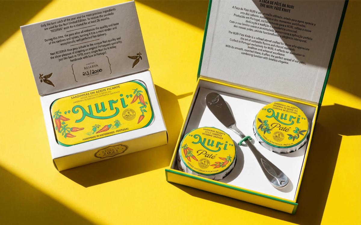
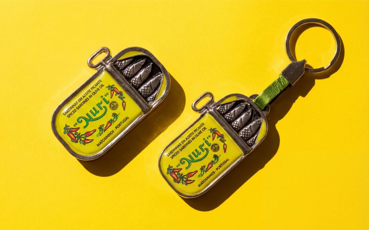
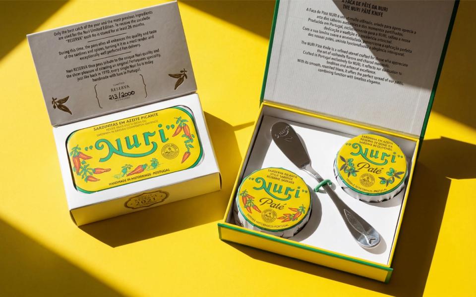
Nuri, part of century-old producer Conservas Pinhais & Cia, embodies the warmth of craftsmanship. “Nuri” means “bright” or “shining” in Arabic, perfectly evoking the glistening freshness of sardines when a tin is opened. Vivid colors, expressive handwritten lettering, and hand-drawn illustrations give the packaging a tactile, handmade quality that modern brands struggle to imitate. Nuri has also carried its identity beyond the tin and into everyday life. Using its highly recognizable yellow-and-green palette, it has created charming merchandise such as key rings and can openers, earning the brand a cult following. Arranged in gift boxes by flavor, this modest food,priced at around NT$200 a tin,has been redefined as a design object worth gifting.
Brand 02: Lucas—Portugal’s Second-Oldest Tinned-fish Brand, Successfully Recast
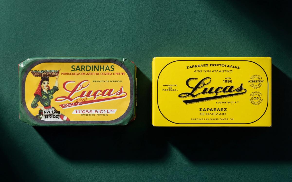
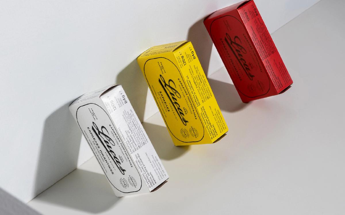
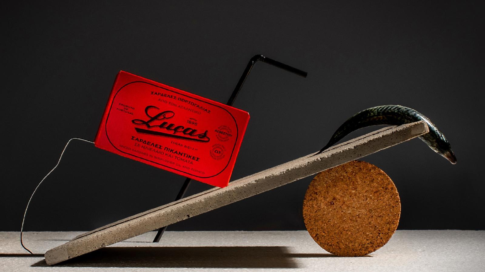
Founded in 1896, Lucas is Portugal’s second-oldest tinned-fish brand. Its identity once centered on a portrait of a fisherwoman balancing a basket of fish on her head, a tribute to the resilience and vitality of coastal life. In 2019, Athens-based design studio Doric Order Driven Design led a major brand overhaul. After years of repeated packaging changes had left the century-old brand’s visual identity muddled,the goal of the redesign was clear: recover the soul of the brand. The team retained Lucas’s classic logotype but removed the fisherwoman from the original packaging. The new design reaches out to longtime customers and younger audiences alike, returning to the classics while retaining a sense of forward motion.
Brand 03: Pinhais—Weaving the Fisherman’s Everyday Life into Design
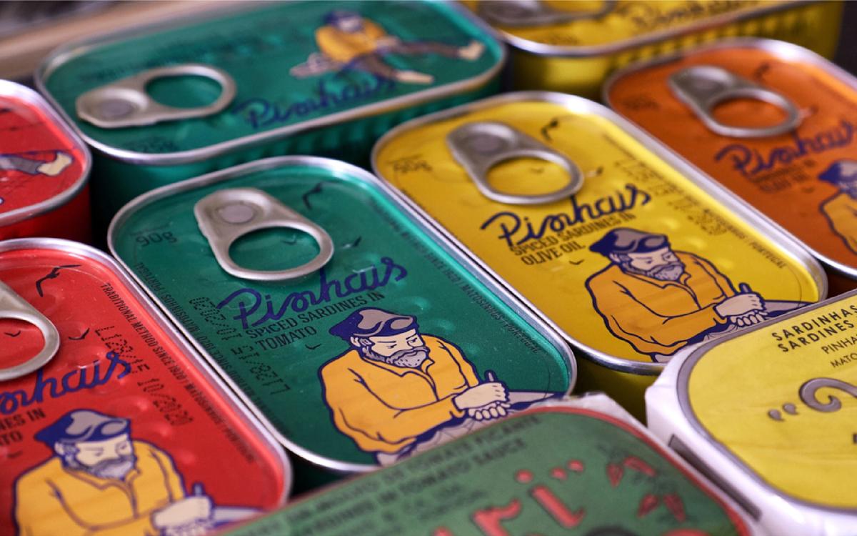
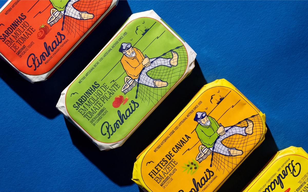
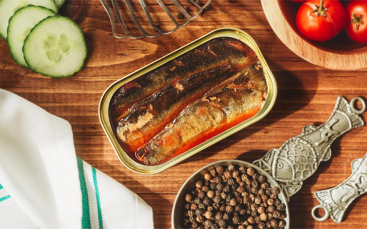
Sister brand Pinhais takes a more minimalist path. Beside the basket at the fisherman’s side, it carefully places a vivid red tomato or chili motif, so flavors are distinguished by more than background color alone. At a glance, the symbols tell you whether a tin contains mellow olive oil or a rich tomato sauce. Fine, modern lines depict the fisherman at his daily task of weaving nets. The century-old Portuguese factory behind both Nuri and Pinhais is also open to visitors. I believe that once you have watched each tin of fish being carefully packed and sealed by hand, those metal tins take on an entirely new dimension of value, and command a new respect.
Brand 04: JOSÉ—The Finest Storyteller of Them All
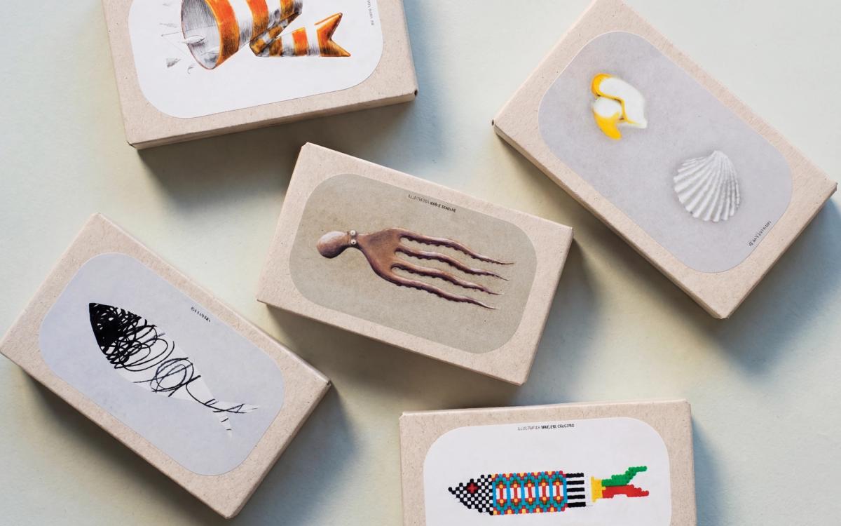
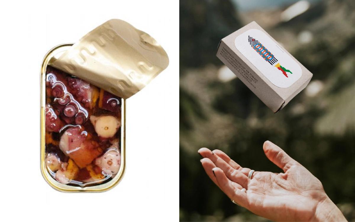
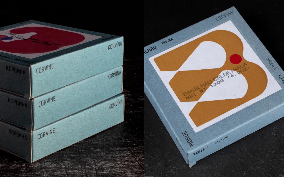
When it comes to breaking the mold completely, few brands in recent years have impressed me as much as JOSÉ. “José” is one of Portugal’s most common names. Countless Josés have gone down in history, while countless others have worked quietly in anonymity.Choosing a name at once distinctly Portuguese and universal in spirit pays tribute to every ordinary yet extraordinary individual.
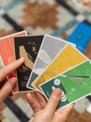
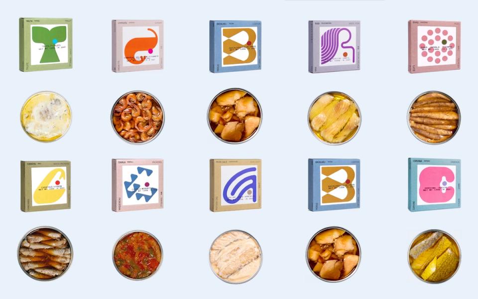
From a design and brand-strategy perspective, the key lies in the name’s Hebrew root, meaning “one who adds.” That mission of adding value is expressed with precision in the product positioning. The brand dispenses entirely with familiar images of fish, sea, and fishermen, replacing them with distinctly modern geometric motifs and blocks of color. On the packaging for smoked trout and pickled octopus, for example, the initial letters B and T are ingeniously transformed into fish-like symbols, smart and endearing at once. JOSÉ offers more than 40 varieties of tinned seafood, as well as playing cards, posters, placemats, and other homeware. In doing so, it overturns the stereotype of cheap raw ingredients and elevates the craft of small-scale producers to the level of premium gifts.
Brand 05: PORTHOS—The Face Macao Trusts Most
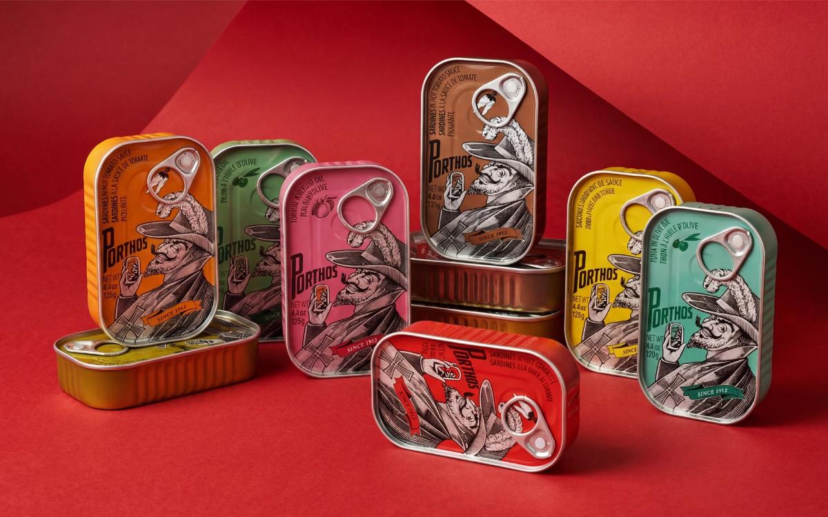
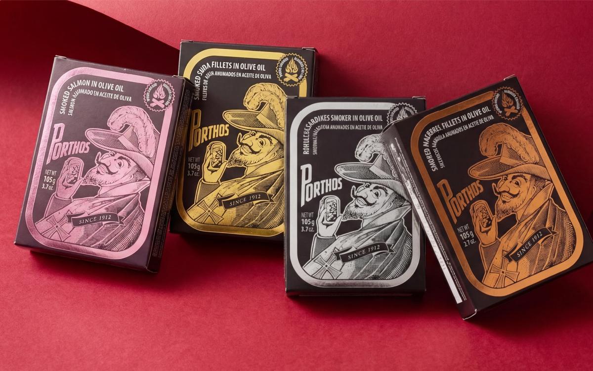
For people from Macao, the uniformed captain on PORTHOS—the Portuguese brand affectionately known locally as “the Old Man”—is a reassuring seal of quality. The name was inspired by Porthos, the musketeer in the 1840s French novel The Three Musketeers. Yet this authoritative portrait was not created until the late 1950s. It proved so popular that it triggered a wave of large-scale imitation, an indirect testament to the success of the brand’s visual asset.
Today, the century-old brand injects fluorescent yellow, vivid orange, and other contemporary colors into its classic medallion composition, then adds a finely made outer box, successfully turning the tin into a fashionable souvenir. In Macao, it has also crossed into local confectionery, with specialty shops offering spicy-fish biscuits and egg rolls filled with fish floss. At around NT$150–200 per tin, PORTHOS is a highly competitive entry point into the world of design-led food souvenirs.
Mak’s Aside
If, like me, you delight in visual variety, JOSÉ will drive you wild. With more than 40 package designs full of geometric motifs and illustrations, it is almost impossible to resist buying them.
But if I had to choose one for my own collection, it would be Nuri. I am especially fond of its honest, unvarnished charm. For just a few hundred New Taiwan dollars, you can hold a century of craftsmanship and history in your hands. It is more than worth it.
In Portugal, historic tinned-fish brands have not faded away as the times changed. Instead, they have chosen a path that transforms the everyday into legend. When we plan a brand or develop a proposal, the challenge is to safeguard that irreplaceable old soul while using new visuals to speak the language of the present. These five cases offer a compelling lesson in how culture, cultivated over time, can return to contemporary life in an irresistibly modern form.

Graphic Designer.Mak
A graphic designer from Macao who now lives in Taiwan, Mak has spent nine years immersed in the design industry, often deep in the details of brand planning and packaging design. She especially enjoys “making the rounds” of supermarket shelves around the world. Beautiful typography and layouts make her heart race; an ingenious structure makes her want to take it apart on the spot. Instagram: @little_mak_